Blog Web Development
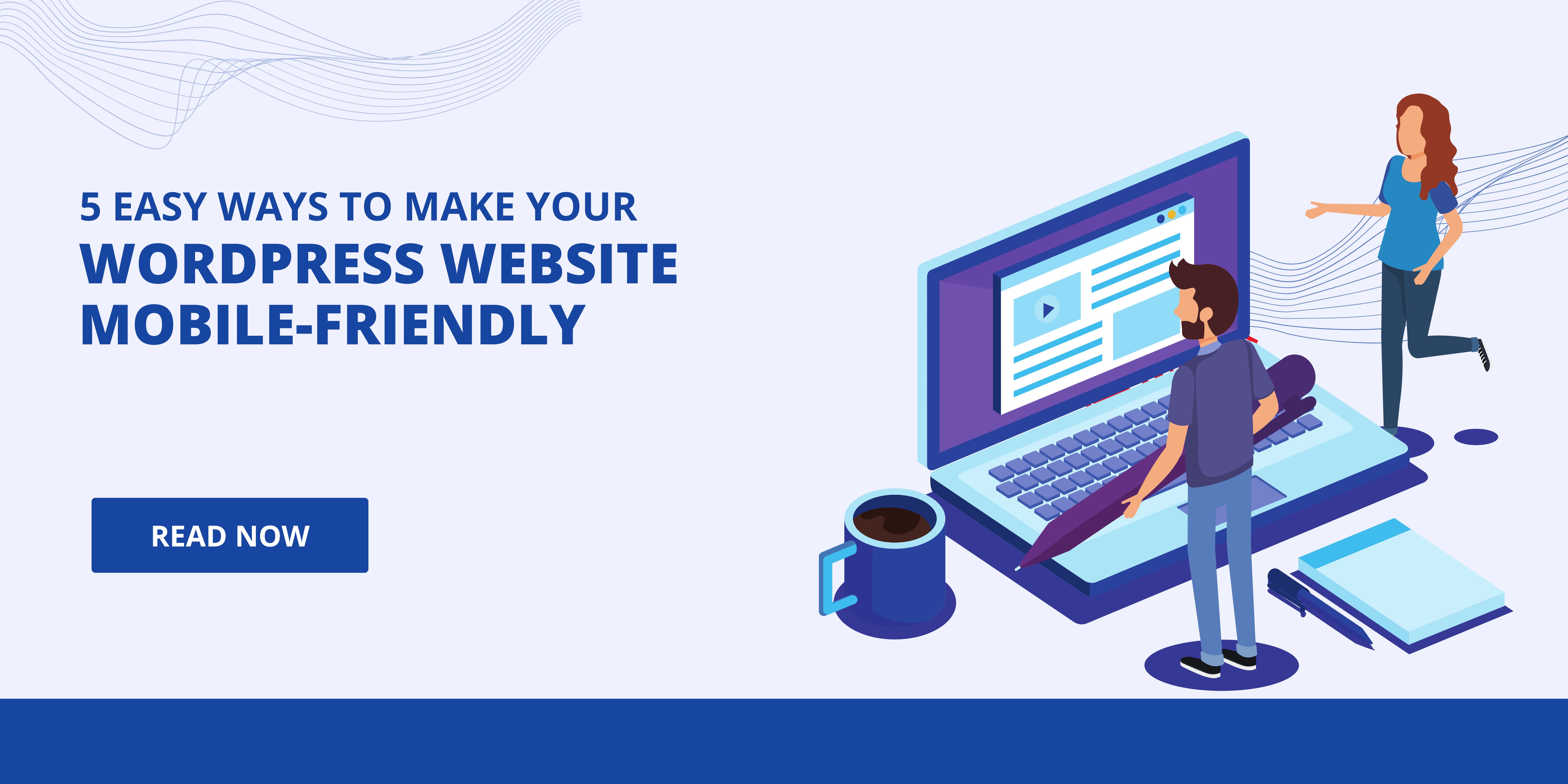
5 Easy Ways to Make Your WordPress Website Mobile-Friendly
Introduction:
The Importance of Mobile-Friendly Websites in Today's Digital Landscape
In the current digital era, having a mobile-friendly website is not just a luxury, but an absolute necessity. Let's imagine this scenario: you're feeling famished and decide to search for a new restaurant using your phone, with the intention of ordering takeout. You stumble upon a promising eatery, but unfortunately, their website appears as a chaotic mess on your screen. The text is minuscule, the buttons are nearly impossible to click, and navigating through the menu is out of the question. Frustrated by this experience, you swiftly move on to the next restaurant that boasts a user-friendly mobile site. This situation repeats itself countless times each day. Hence, it becomes evident why having a mobile-friendly WordPress website is vital for the success of your business.
1. Choose a Responsive WordPress Theme
That's a great start! A responsive theme is absolutely the foundation for a mobile-friendly WordPress website. Here's how you can expand on this point:
-
Responsive themes automatically adjust their layout to fit any screen size, from desktops to tablets and smartphones. This ensures your website looks clean, clear, and easy to navigate on any device.
-
Many high-quality responsive themes are available for WordPress, both free and premium. Consider factors like design style, customization options, and features when choosing a theme.
2. Optimize Images and Videos for Mobile Viewing
Optimizing images and videos is another crucial step for a mobile-friendly WordPress Website Development. Here's how you can flesh out this point:
Large image files can slow down your website's loading speed, especially on mobile connections. This can lead to frustrated visitors who bounce before your content even loads.
There are several ways to optimize images and videos for mobile:
-
Resize images to appropriate dimensions for mobile screens.
-
Compress images using tools or plugins that reduce file size without sacrificing significant quality.
-
Consider using next-generation image formats like WebP, which can offer smaller file sizes compared to traditional JPEGs.
-
Optimize videos for mobile playback by using shorter lengths, lower resolutions, and mobile-friendly codecs.
3. Use Plugins to Enhance Mobile User Experience
Here's how you can craft a compelling section on using plugins to enhance mobile UX:
Supercharge Your Mobile Experience with Plugins
While a responsive theme and optimized media are essential, plugins can add an extra layer of polish to your mobile website. Here's how these handy tools can elevate your mobile user experience:
-
Simplified Mobile Menus: Stock menus can be cumbersome on small screens. Plugins like "WPtouch Mobile Menu" or "Max Mega Menu" create user-friendly mobile menus that are easy to navigate with a tap.
-
Faster Mobile Forms: Lengthy forms can be a pain on mobile. Plugins like "WPForms" or "Gravity Forms" allow you to create streamlined mobile forms that are easier to fill out on the go.
-
Optimized Images: We mentioned image optimization earlier, but plugins like "Smush" or "EWWW Image Optimizer" automate the process, ensuring your images are always mobile-friendly.
-
Lazy Loading: This technique delays the loading of images below the fold until they're needed. Plugins like "BJ Lazy Load" or "Rocket Lazy Load" can improve initial page load speed, especially on slower mobile connections.
-
Push Notifications: Keep users engaged with relevant updates using push notification plugins like "OneSignal" or "Pushwoosh." This is a great way to re-engage visitors and drive repeat traffic.
Remember, while plugins are great, it's important to choose them wisely. Too many plugins can slow down your site, so focus on those that offer specific functionalities to enhance your mobile experience.
Must Read : Top 10 Laravel Development Companies in the USA in 2024
4. Prioritize Speed and Performance on Mobile Devices
The Need for Speed: Optimizing for Mobile Performance
A mobile-friendly website is fantastic, but if it takes forever to load, visitors will tap away in frustration. Here's how to ensure your WordPress site delivers a speedy mobile experience:
-
Mobile Caching: Caching stores website elements like images and scripts on the user's device, so they don't need to be downloaded every time they visit a page. Plugins like "WP Super Cache" or "WP Rocket" can help implement mobile caching.
-
Content Delivery Networks (CDNs): A CDN stores your website's static content on servers around the world. This reduces the distance data needs to travel, resulting in faster loading times for mobile users in different locations.
-
Minimize HTTP Requests: Every element on your website (image, script, stylesheet) requires an HTTP request. Plugins like "Autoptimize" or "WP Rocket" can help minimize these requests by combining and compressing files.
-
Browser Caching: Enable browser caching to instruct user browsers to store website elements locally, further reducing load times on subsequent visits. Most web hosting providers offer options to enable browser caching.
5. Test Your Website Across Different Devices and Browsers Regularly
The Final Touch: Regular Testing for a Flawless Mobile Experience
Building a mobile-friendly website is just the first step. To ensure a seamless experience for all users, it's crucial to test your website regularly across different devices and browsers.
-
Utilize Browser Developer Tools: Most browsers offer built-in developer tools that allow you to see how your website looks and functions on different screen sizes. Chrome DevTools and Firefox DevTools are popular options.
-
Mobile Emulators and Simulators: These tools mimic different mobile devices and allow you to test your website's functionality on various platforms. Popular options include Google's Chrome DevTools emulation mode and browser extensions like BrowserStack.
-
Real-Device Testing: While emulators are helpful, nothing beats testing on actual devices. Borrow devices from friends, family, or colleagues to test your website on a variety of operating systems and screen sizes.
Enhance Your Online Presence with Professional WordPress Web Development Services:
In today's digital world, having a website is no longer optional. But for many businesses, simply having a website isn't enough. To truly stand out and achieve your online goals, you need a website that is not only functional but also visually appealing, user-friendly, and optimized for search engines. This is where professional WordPress web development services come in.
Here's a breakdown of the impact these services can have on your business:
-
Enhanced User Experience (UX): Professional developers understand the importance of creating a website that is intuitive and easy to navigate. They can craft a user-friendly interface that keeps visitors engaged and coming back for more. This translates to increased brand loyalty and customer satisfaction.
-
Improved Search Engine Optimization (SEO): A well-developed website is more likely to rank higher in search engine results pages (SERPs). Professionals ensure your website is built with SEO best practices in mind, including optimizing page speed, content structure, and technical elements. Higher search rankings mean more organic traffic and potential customers.
-
Custom Functionality: Off-the-shelf themes and plugins can only take you so far. Professional developers can create custom features and functionalities that cater to your specific business needs. This allows you to stand out from the competition and offer a unique online experience to your visitors.
-
Scalability and Growth: As your business grows, your website needs to be able to handle increased traffic and functionality. Professional developers build websites with scalability in mind, ensuring your site can adapt and evolve alongside your company.
-
Security and Maintenance: Cybersecurity threats are a constant concern for businesses of all sizes. Professional developers implement best practices to keep your website secure from malware, hacking attempts, and data breaches. They can also handle ongoing maintenance tasks to ensure your website runs smoothly and efficiently.
Beyond these core benefits, professional WordPress development services offer additional advantages:
-
Time Savings
-
Expertise and Experience
-
Peace of Mind
Professional WordPress web development services can have a significant impact on your business by:
-
Improving user experience
-
Boosting SEO ranking
-
Adding unique functionality
-
Ensuring scalability and growth
-
Providing security and maintenance
Choosing the Right Partner for Your WordPress Web Development Needs:
Key Considerations and Factors to Look For
Having a well-developed WordPress website is crucial for any business in today's digital landscape. But with so many WordPress development agencies and freelancers out there, selecting the right partner can feel overwhelming. Here are some key considerations and factors to look for when making your decision:
1. Define Your Project Needs:
-
Start by outlining your specific goals and objectives for the website. What functionalities do you need? What kind of user experience are you aiming for? Do you require e-commerce capabilities or integrations with other platforms? Having a clear understanding of your needs will help you find a partner with the appropriate skillset.
2. Consider Your Budget:
-
Be realistic about your budget and communicate it upfront. Freelancers typically offer lower rates than agencies, but may have limitations in terms of resources and expertise. Agencies often provide a wider range of services but come with a higher price tag.
3. Evaluate Experience and Portfolio:
-
Look for a partner with a proven track record of success in WordPress development. Review their portfolio to see examples of their work, particularly projects similar to yours. Ask for client testimonials and references to get a sense of their work ethic and communication style.
4. Communication and Collaboration:
-
Effective communication is essential for a successful project. Choose a partner who is responsive, easy to reach, and willing to listen to your ideas. Discuss their preferred communication methods and project management tools to ensure a smooth workflow.
5. Technical Expertise:
-
Ensure the partner possesses the technical skills necessary for your project. This includes knowledge of WordPress core functionalities, plugins, themes, security best practices, and SEO optimization. If your project requires custom development, assess their experience in relevant programming languages like PHP and JavaScript.
6. Ongoing Support and Maintenance:
-
Websites require ongoing maintenance to ensure optimal performance and security. Ask about the partner's support offerings, such as bug fixes, updates, and security monitoring. Will they provide ongoing support, or is it an additional cost?
Beyond these core considerations, here are some additional factors to keep in mind:
-
Location and Time Zone
-
Scalability and Growth
-
Personality and Cultural Fit
By carefully considering these factors, you can choose the right Custom Website Design & Development Company who will help you create a website that meets your specific needs and drives your business success.
In Conclusion:
Start Implementing These Easy Steps Today to Ensure Your WordPress Website is Fully Optimized for Mobile Users!
By implementing these simple yet effective strategies, you can transform your WordPress website into a mobile-friendly masterpiece. Remember, a website optimized for mobile users translates to a better user experience, increased engagement, and ultimately, more success for your business. So why wait? Start putting these easy tips into action today and watch your mobile traffic soar!
This revised conclusion emphasizes the benefits of a mobile-friendly website and motivates readers to get started.
Form your durable team with us

Services
- Dedicated Remote Developers
- MVP Development
- Product Development
- Custom Software Development
- Digital Product Designing
- Support & Maintainance
- Integration Services
- Mobile Development
- Digital Marketing
- Bespoke Website Design
- Data Migration
- IT Consulting Services
- Zoho CRM Consultant
- WhatsApp Business Solutions
- AI Agents Development
Mobile App Development
Digital Marketing
Company
Web Development
Solutions
- Artificial Intelligence
- e-Commerce Software Development
- e-Learning Software Development
- ERP Software Development
- Inventory Management Software
- Point of Sale
- Restaurant Software Development
- Custom Software Development
- Custom CRM Software
- Live Conferencing
- HR Management
- Amazon Inventory Management
- Booking Scheduling System
- ChatGPT Integration Service
- Custom Billing Software
- Chat Application Development
- Talent Management System
- Labour Management System
- Custom Pharmacy Management Software
- eBay Inventory Management
- Retail Software Development Company
- LMS Development Solutions
- Warehouse Management Software
- Financial Software Development
- Healthcare CRM Software Development
- Medical Inventory Software
- Medical Billing Software Development
- Health Insurance Software
- Hospital Inventory Management
- View All Solutions

